Saturday, March 15, 2014

Anime and Manga Drawing Classes at Chesterfield Libraries

Since January 2013, I have been teaching some Anime and Manga drawing workshops with Chesterfield County Public Libraries. The classes were offered occasionally throughout the year on Saturdays as part of the Libraries' Teen Studio Program. The library and I provided all materials to students for the program.

These classes have also led to other opportunities like teaching at the Chesterfield Library Comic Con Events and being a guest artist/teacher at Meadowbrook High School's Anime Club.

 So far, I have taught 4 installments of the Classes covering different aspects of the topic.

The first class was Introduction to Manga and Anime. This class mainly covered how to draw faces, and figures in the Anime style. I also covered drawing facial expressions, mouths, hands, feet, clothes, and hair. Students used the information and techniques I taught them to draw their own Anime/Manga character. I taught students how to transfer drawings using carbon paper and how to finalize characters through inking. I provided various inking materials and techniques for them to experiment with including India ink, brushes, brush pens, multi-liner/micron pens, etc. I also taught a short version of this lesson at the 2013 Chesterfield Comic Con Event, which covered how to draw the face in the Anime style.
 
Ad for Intro to Manga and Anime Classes in the library's magazine
The second set of classes explored Character Design. I taught students how to use a matrix/chart to get unlimited ideas for characters, personalities, costumes, and environments. The matrix technique was from a book called The Manga Matrix by Hiroyoshi Tsukamoto. (This book is an absolutely awesome reference to have! I brought a copy to class so everyone could take a look at it.) In addition to the matrix, I reviewed how to draw the face and figure, taught how to draw unique characters from a basic shapes, body proportions for realistic vs unrealistic style characters, character variation, using a silhouette to check the strength of a character design, and inking.

Postcard Ad for Character Design Classes
 The third installment of the classes dealt with How to Make a Manga. First, I quickly reviewed how to draw a face, the figure, and character design. The main topics covered on making a manga included layout, panels, speech/word bubbles, font, sound and line effects, black and white vs. color in manga, planning and process of making a manga, publishing/sharing a manga, and inking. I had two exercises built into the lesson for students to try their hand at story telling, paneling, and speech bubbles.
Ad for How to Make a Manga Classes
My most recent class discusses How to Draw Chibi Anime and Manga Characters. In this lesson, I discuss what a chibi is, the characteristics of chibi's, body proportions, chibi characters vs regular anime characters, and how to draw a chibi. For drawing chibi's, I covered the face, eyes, bodies, mouths, facial expressions, hands, feet, clothes and hair. I taught this lesson at Meadowbrook High School recently and I will also be teaching it at this year's Chesterfield Comic Con Event on March 22nd from about 10:30-11:30.
Ad for 2014 Chesterfield Comic Con Event
These classes are so much fun! The students really seem to love them. We often talk about the anime they lik and even play some clips and songs from their favorite shows at the end of class. I love getting to see their drawings, they are really talented artists!

Sunday, February 9, 2014

Cake Decorating Art

Sometimes it is a lot of fun to apply my skills to something new and different. In this case, cake decorating! I had the chance throughout the previous year or two to try my hand at making fondant figures and cake designs for a few family events.

The first, was a set of fondant cats and a fondant house to go on two groom's cakes, for my cousin's wedding reception. The cats were really fun, I got pictures of my cousin's cats and matched the markings to look like them. Working with fondant was very similar to working with clay. The only real noticeable differences was that I had to use an Exacto blade to cut detailed shapes, use tooth picks to help support the legs and head while they dried, and I used water to attach pieces together (instead of pinching or pressing them together). The water is just put on lightly with a paintbrush and it acts like glue.

Here are a few pics of the cats before and after they were placed on their cake. (My Mom did a fantastic job baking and frosting the spice cake itself. It turned out great!)


The other groom's cake depicted my cousin's house at Christmas with 'Marry Me' spelled out in lights on the roof. This was how my cousin proposed to his fiancee, so we recreated it for their cake. My Aunt and I teamed up on this one together. We both got the textures and main shapes cut and attached. I helped add in little details like transparency paper over the yellow windows to make them look more like glass and the wreath on the door. My Aunt wrote the 'Marry Me' with icing after attaching the house to the cake. She also baked and frosted the house cake. (Her chocolate cake is delicious!)


The next cake I got to work on was for a party following the 2013 Monument Avenue 10K Marathon. A lot of friends and family participated for the Amanda C. Brady Foundation for Youth. This Foundation was started in memory of my brother's fiancee. You can check them out at amandabradyfoundation.com or on Facebook at https://www.facebook.com/amandabradyfoundation?ref=profile. All the runners wore baby blue or pink T-shirts with the Foundation logo on it to show their support. After the Marathon, everyone met up for a party to celebrate. I made the Foundation logo out of fondant for the cake. (My Mom baked and frosted the cake itself, she is a pro!) This one was really challenging because of the thick and thin lines of the logo and the general shape. At first, I tried to get a template of the logo and cut/trace the fondant with an Exacto blade. This didn't work too well, the parts of the logo began loosing their shapes and breaking in thinner areas. So I scrapped that approach, and decided to cut strips of fondant and use them to layout the logo. This method worked like a charm! I let the logo dry and harden overnight and then I transferred it to the cake.The Foundation is participating in the Marathon again this year, please support them! They accept donations and pledges to run on their website, donations go toward scholarships and other activities related to the Foundation.

The last cake I worked on, was for a birthday. I made a Tiki Hut design on a beach with waves coming in. This one was really challenging because it was all icing work. I experimented with different tips on the decorating bags to get different shapes and textures. My favorite was the tip I used to get the wood texture on the hut. In some ways icing is a forgiving medium, if I made a mistake all I had to do was get a toothpick or knife to remove the flaw and begin on it again. I added in some cinnamon and sugar to make the sand under the Hut. It was a lot of fun to go in and add little details like the swings, crab under the Hut, glasses on the table, and flowers here and there. Really fun Summer B-Day cake!


That is it for now. If I wind up making some more cool looking cakes this year I will post some pics of them. Food art is fun!

Friday, January 24, 2014

Creative Christmas Wrapping

Finally back for another update! This one is something I have been meaning to post since Christmas. (Excuse the picture quality- I had to use my cell phone, my camera was dead)

Penguin, Reindeer, & Polar Bear Presents (Better quality, individual pics below)
 Here is the story: My parents and I decided to give money cards to my teenage nieces and nephew. We also wanted them to have a little something to open and be able to use on Christmas Day. Skittles is a old favorite of theirs, so they each got a bag. While I was wrapping, I thought it would be cooler to make it more interesting, instead of just sticking the Skittles in a box or gift bag. I had seen some pictures on Facebook of how people had wrapped presents to disguise what they were. Most used cardboard to build newly shaped boxes for presents, but I didn't have the materials or that kind of time (I was wrapping these late on Christmas Eve - Procrastinator!!)

I started to try to manipulate the bag itself, to see what would happen. I noticed that I could get a shape kind of like a body, really more like a beanie baby. Rubber bands were the best way to help them keep their shape. Once they were tied up, they were really sturdy. Here is what they looked like at this point:

Step 1: Make the body shape and bind with rubber bands

Next, I needed to add some heads to the bear and reindeer bodies. (The penguin didn't need anything extra, I just shaped his head and neck with the rubber bands.) I made the head forms by balling up scrap wrapping paper and using artist tape to bind it together and attach it to the body.
Step 2: Add head to Reindeer Body
Step 2  Cont.: Add head to Bear Body
The last steps were to wrap the bags with wrapping paper and add in little details. Wrapping was just trial and error until I got them all covered properly. I drew in eyes, noses, and mouths with a sharpie marker. Next, I cut and folded wrapping paper to make the ears and tails on the reindeer and bear, and the wings and beak of the penguin. I cut long strips of wrapping paper for scarves and reins for the reindeer. To make the antlers for the reindeer, I used a scrap wrapping paper tube and cut out the antler shapes. These were nice and sturdy, since this was a heavier paper and the curl of the tube made the antlers curve as well. This was a nice effect. The antlers were taped on. Here are the final pieces!

Penguin
Reindeer
Polar Bear

 The kids really seemed to love them.  They liked them so much they didn't want to unwrap them right away. They did take a stab at guessing what they were, and got it right pretty quick!

Fun wrapping experiment! I may try this again at some point, there is a lot of problem solving involved and it keeps things interesting!


Sunday, September 15, 2013

Photoshop Lesson Update on Art Ed Blog

I just added one of my Photoshop lessons on my Art Ed. blog at http://kellynixonarted.blogspot.com/. 

Bear-Frog Animal Hybrid: Demo Model

This lesson was to make an animal hybrid by using photo-manipulation. It was aimed at Art I students, check it out for more details. 

You may recognize the Bear-Frog image featured for the lesson from my art portfolio pages. I had originally made him as a demo model for this lesson and liked him so much I kept him as an art portfolio piece : ). 

Enjoy!

More artwork and lessons coming soon!

Tuesday, September 3, 2013

Art Education Blog Launched!

I have launched a new blog dedicated to my love of Art Education at http://kellynixonarted.blogspot.com/. I will be adding more content over the next few days as a go through my art lessons, check back soon for more updates! I have also added links to my other websites to the right. Check them out!


Monday, June 3, 2013

Live the Lifestyle Logo Design

Here is a new logo design I made for the Live the Lifestyle: Weight Management program. This logo was a fun one to do. Most of the challenge was in figuring out the best way to transition the colors from green to blue, spacing in general, and other little design elements. I did get to play a bit more with the gradient tool in Adobe Illustrator. For the concept, the client wanted to use a tree design and incorporate measuring tape into the design. She also wanted to make the 'L' from Lifestyle merge with the tree.Color-wise we tried some variations and decided that green and blue best reflected the healthy and calm feel that the client was going for. I am very pleased with how it turned out. Keep your eye out for the logo, it has been on Facebook quite a bit!


Live the Lifestyle Logo Design


**This logo is copyrighted to the client who commissioned it, do not use without permission!**

More Queen City Sports and Social Club Designs

Time for some updates!

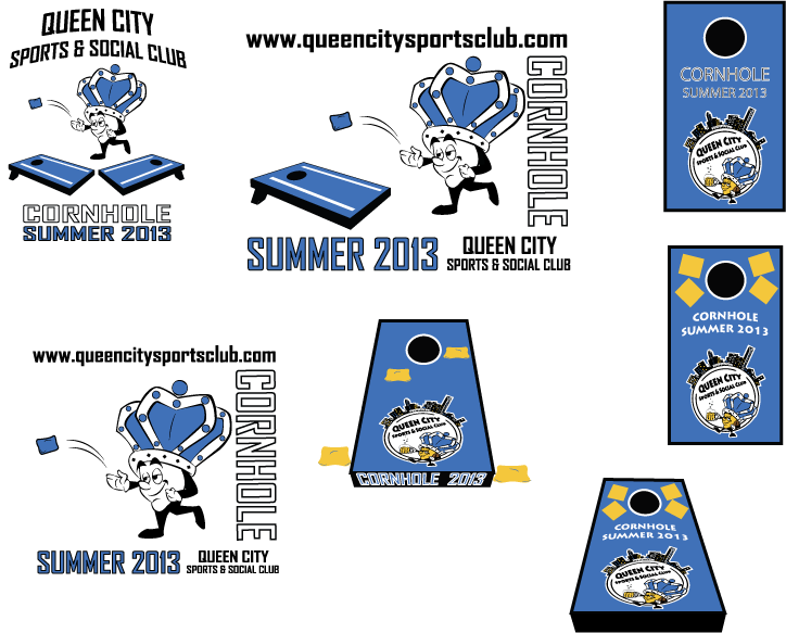
Here are a few new logo designs I have been working on for Queen City Sports and Social Club in Charlotte, NC. These are some different logo design samples intended to be used for Cornhole and Volleyball T-shirts this year. I combined each sport into 1 file each to make them easier to check out. Each image is a possible T-shirt logo, so there are 7 possibilities for Cornhole and 4 for Volleyball.


Cornhole T-shirt Design Samples


Multiple sports allows for multiple logos!  Here are a few designs for the Beach Volleyball T-shirts.


Beach Volleyball T-shirt Design Samples
**As always, all logos are copyrighted to the client who commissioned them, do not use without permission!!**