This is something I've been meaning to upload for a while, but I hadn't gotten around to photographing it until now. Last Spring I made a box portfolio that was designed to take with me on interviews, etc. and hold my art samples, business cards, postcards, and DVD portfolio. I based the design/structure after a japanese style bookbinding method that I learned in a class a while back.
It's made out of some thin sheets of wood for the top and bottom, the sides are pieces of plywood that I stacked and glued on top of each other. I lightly painted the plywood so the lines in it could show through and resemble pages. I made the cover by cutting out some windows with a drimmel and covering the wood with paper. The paper is actually only glued on the edges because it kept getting bubbles in it every time I tried to glue the whole thing down. I went through about 2 extra papers before I got it right. The windows are some plastic overhead projector paper. I added a ribbon in the book so the contents of the could be easily removed.
Overall, I'm really pleased with the way it turned out. There are a few little issues with it though. The inside could be bigger, I've had to trim down papers to make them fit. The only other thing is the hinge were the top opens. There isn't enough space between the spine and the cover part of the book, so the top can't be fully opened. I've been thinking about making a second one to go with my Art Education Portfolio that will be made so it won't have these issues. I'll definitely be hanging on to this one though, for my illustration portfolio. I learned a lot by making this box portfolio and actually used power tools on my own for the first time in the wood shop :D. It was challenging and a lot of fun to work though the problems I had while making this and now that I have a better idea of how to approach it I feel like I could make another one easily.
That's all for now! Enjoy!
Monday, December 21, 2009
Monday, November 9, 2009
Isometric Perspective
I did another tryptic presentation for one of my classes. This time it had to focus on an artistic element or concept. The one I chose was isometric perspective. It is a form of parallel perspective that has no vanishing points and all of the axes are equally foreshortened. Also in this form of perspective, the scale of an object doesn't change, so an object would appear the same size anywhere in the picture instead of getting smaller with depth. Since there are no vanishing points there is no optical distortion. Isometric perspective is commonly used in traditional Asian art (it was started by ancient Chinese scroll painters), in technical/engineering drawings, and in some video games. I picked images from Hiroshige and M. C. Escher to illustrate the concept.
That's it for now.
That's it for now.
Monday, October 19, 2009
James Jean Presentation
For my Art Ed. class we have to give a presentation on a contemporary artist. For mine. I chose the painter/illustrator James Jean. I really love his work. His color choices, surrealist subjects, attention to detail and overall style really grab the eye and command attention. Jean has a totally unique way of approaching his subject matter and I find his work really inspiring. His website is www.jamesjean.com and his blog is www.processrecess.com. His blog is really great; Jean posts the stages of his art from thumbnail to final piece. It also goes back several years into his portfolio.
Well anyway here is the layout I made as a guide for my presentation board. The board is one of those that has three panels and stands up on its own. I also made a design for the back of the board, but I won't be using it because of the cost of printing the images large enough to fit the board.
This is the front of the display board that I will be using.
This is the design for the back that I won't be able to use. I thought it looked pretty cool though.
That's all for now
- Later
Sunday, October 11, 2009
Bunny Card Done!!
I finally finished the bunny card!! All that is left is a test print and then uploading both sides to overnightprints.com! Here is the final:
Side one with party info- I removed the address and phone # for privacy reasons.
Side two- Photos are arranged with the earliest at the top and the most recent at the bottom. The big one is the newest of the pics.
-Later
Saturday, October 10, 2009
Bunny Card Update
I haven't had too much time to work on the bunny card, but here is where I am now. I have them drawn up in illustrator, but I'll be adding and tweaking them still... like adding detail to the crowns, etc. Once I got the card mocked up, I tried putting random photos onto it, but the higher contrast of the photos with the flat bunnies didn't flow well, so my sister and I decided to make the bunny portion go on one side of the card with the party information and the photos go on the other side, in case anyone wanted to just frame the photos. I think that will work a lot better, but I haven't had a chance to go that far yet.
Here is a detail of the bunnies, so far. I'll be taking them and putting them on the redesigned-double sided card. They still need some more detail and I'll probably try to give them higher contrast or shading to help them pop out more.
Here is the first mock-up I was trying out. The high contrast photos just didn't work with the flat bunnies, so this version will be scrapped and on the new one this side will be all photos and the other will have the bunnies and party info. The orientation will still be horizontal. The text would have gone over the the big crown in the middle.
-Just a note: these aren't the photos that will be in the final, they were just put in to give me an idea of how it would look.
Sunday, October 4, 2009
State Fair of VA
I went to the State Fair yesterday at the new location by Kings Dominion. First off, traffic was HORRIBLE!!! It was bumper to bumper traffic from the I95 in Ashland until we parked. One of the main hold ups was that they stopped incoming traffic to allow outgoing traffic out. They need to solve that problem, with a fly-over or something. Also now they charge $5 for parking when it used to be free at the old location, they must have made a fortune- there were more cars there than I could count. Once we got parked and tried to enter, we didn't know where to go. There were no signs telling which way to go, and the new location is HUGE, its hard to find your way around on the first trip. We ended up just following people and at one point we got directions from a police officer. They had shuttles, but there were no where near enough to handle the amount of people, it was quicker to walk than wait in line for a shuttle.
Once we got into the fair grounds it was much better. We had bought tickets online, so we bypassed ticket lines. We got a map as soon as we got in and that helped a lot. We ended up going through two tunnels that ran under the road to get to the fair- parking was on one side of the road, the fair was on the other, and the tunnels connected them. The tunnels were kind of cool. The fair itself was the same as always, great food, games, rides, the animal area, etc were all there. They were just more spaced out. The amount of people there was unreal, I don't remember the old location at RIR having anywhere near that amount of people. It seemed like triple or more of the amount of people at RIR. Even though the attractions were a little more spaced out, it was still crowded with the amount of visitors. It felt like it would be easy to get separated from your group, cell phones were a must. One cool thing there, is a gorgeous old brick mansion up on a hill before the fair splits from the entertainment area to the farm animal area. That place was awesome, if your there it is definitely worth a look.
When we left traffic was still bad, but we managed to get out a little quicker than when we got there.
Overall the fair itself was great, but the traffic and parking situation was AWFUL. I hope they can work out the kinks with parking for next year. I also think it will be better to take a day off during the week and go during the day. That could help avoid traffic and maybe some of the crowds.
Here is an overview of the new location, there is more parking to the right of the map that is not shown and that was where we had to park.
Here is a detail of the attractions- there was a lot to see!!
Monday, September 28, 2009
B-Day Invitation: Rough thumbnail sketches
Here are a few rough thumbnail sketches for the birthday invitation. The layout is on a 5x7 postcard, the left side will have a big vertical photo and the right side will have four small photos- two at the top and two at the bottom. In-between the four small photos, there will be a horizontal panel that will have the design and party information.
This is the design my sister picked out, It pulled two different designs together - the sizes of the bunnies may need to be adjusted once the photos are incorporated, since they overlap the photo areas a little bit. The crown will be pushed back more (close to the background value) and text will overlay it.
Sunday, September 27, 2009
Birthday Invitation Design
My niece has her 1st B-Day coming up and my sister and I have been looking through birthday invites, mainly the photo ones, so we could show how she has grown over the past year. Most of the ones we could find for girls had boring designs or were way too expensive. So I decided to design a custom card, upload it to overnightprints.com, and order from them for a much more reasonable price. Plus since I've ordered from them in the past, I know their work turns out well.
I'm planning to sketch out the design tomorrow and create the invite in Illustrator. My sister wants a princess theme, but simple crowns and wands are kind of boring, so I'm thinking of a bunny in a princess dress wearing a little crown. I want the head to be tilted a little with the crown at an angle. Since, the baby is turning one, I'll have one of the bunny's ears standing up and the other floppy. About 5 pics of my niece will be included, one big and the others smaller. I want to keep the color scheme simple, it will mainly pinks, purples, and maybe whites. I'll play with the design and colors more once I get started.
Expect sketches tomorrow and more process pics as the week goes on.
Thursday, September 24, 2009
Illustrator Tutorial, Fall TV Premieres
Here is a little insight into how I work with Adobe Illustrator. This is a tutorial I made for converting a photo into an illustrator drawing. This is generally how I work in illustrator for the realistic pieces. I take my own reference photos and work from them. With other illustrations, like the previously posted Aesop illustrations, I make a line drawing traditionally, scan it in, adjust levels in photoshop, do a live trace in illustrator to vectorize the image, and then I proceed in the same manner described in the tutorial. Later, I add in textures in photoshop. Enjoy.
On a side note I just finished watching the premiere of Grey's Anatomy. It was a total tear jerker. If you haven't watched it and consider yourself sensitive, grab your tissues. It did have some humorous parts including Callie walking nonchalantly past Mark's girlfriend into the bathroom, while he was taking a shower, to ask him a question and when Izzie had her usual inappropriate reaction to sad issues- She left the funeral service to go bust out laughing and the others joined in as well. Just like the narration says, everyone has their own way of passing through the stages of grieving. RIP George, we'll miss you!!!
Flashforward was pretty good too, but I'll reserve judgement until the plot has progressed some more. The one man who was conscious while the rest of the world blacked out is really interesting, so is the depiction of what would happen if people blacked out- cars, planes, and helicopters crashing, surfers drowning, the surgeons passing out. A lot of these I wouldn't have thought about. Some of the characters said the blackout was a blessing, but I kept thinking: not for the people who died during the blackout. I also got the impression that TV is showing more graphic images than it used to, whether that is good or bad I haven't decided yet.
-Heroes was pure awesomeness! The speedster with the knives and the tattoo manipulator were my favorite new additions. I'm glad Danko is gone, I never really cared for him to begin with. As always Hiro, Ando, and Sylar were fun to watch. I busted out laughing at the point when Hiro and Ando were called to save a cat and Hiro froze his own time. Ando rolling him around on a dolly was priceless. The compass thing and the burial of an unknown character were a little odd, but its too soon for those explanations. I intend to enjoy the ride for now. I also thought it was funny that two characters from Days of our Lives were on there and they both didn't last long either, they were the water delivery man Matt sent away and Claire's 1st roommate that died.
Tuesday, September 22, 2009
Web Site Design
Here is a design I came up with for my illustration website last spring. I'm taking a web design course now, so I should have it live by the end of the semester. I'm thinking of revisiting the design though, I think it should be more visually interesting. I'm not sure what I'll end up adding, but I'll post some different versions later.
Monday, September 21, 2009
Train & Alexandria Pics
Like I said yesterday, I finally went on my first train ride, to Alexandria, VA! Overall I thought it was pretty cool. It was interesting seeing the landmarks I know from driving from the train's perspective. I was surprised how smooth the train took off, I guess I expected it to be a little jerky like a plane. I did get a little motion sick though, it felt like I had a knot in my throat for half the trip. It caught me a little off guard when the train would jerk to one side as it switched tracks, but I got used to it after a while.
We had to make several stops on the way and I thought the differences in the stations were pretty cool, though I didn't get to photograph them all. My favorite was the Ashland Station, it was a little brick colonial-style station.
To pass time, when I wasn't feeling motion sick, I started reading my copy of Dan Brown's new book, The Lost Symbol. It grabs your attention pretty quickly and I'm already having trouble putting it down. I definitely recommend his books, in my opinion they could all be made into movies. My professor was also reading a copy of the book on her kindle. Those are pretty cool, basically you can buy e-books, load the info on the kindle, and have multiple books stored in there. It is supposed to replace textbooks one day. I could have used that back in middle school, my book-bag easily weighed 30lbs.
For those who were wondering this is what a kindle looks like, its really thin too.
When we got to Alexandria we went through Old Town Alexandria. There were tons of shops and restaurants. Pretty much all of them were brick and looked colonial. They were beautiful. We were walking too fast for me to get pics of town, though. We also went to the Torpedo Factory Art Center, which was sweet. There were three floors of artists' studios and galleries that were open to the public. Most artists were there so you could see how they worked, talk to them, browse through their galleries, and buy their work. I bet it would be incredibly inspiring to be surrounded by such great artists and art everyday, I really wish something this cool was in Richmond. Not to mention it overlooked the Potomac River, so the people on the waterfront side had amazing views out their studio windows. If your interested in checking out the Art center, their website is www.torpedofactory.org.
Here are the Pics, most of them are from the train stations.
Fredericksburg Station:
Alexandria Station:
Even the Phones had a Colonial touch!
River we went over, though I don't remember which one...
Masonic Temple aka the Lighthouse just outside of the Alexandria Station.
That's all for now, Enjoy.
Sunday, September 20, 2009
Busy, Busy, Busy
Its been a busy weekend!! Friday, I went on my first train ride to Alexandria with my Exploring the Future class. We went to talk to a futurist about forecasting the future, most everything in that class has a tendency to make you think outside the box or just blow your mind in general. The rest of the weekend was spent doing birthday celebrating for my mom (We went to Capt. George's in Williamsburg!) and writing a paper. I don't have much time to talk about it now, b/c I actually have to finish that paper :'( but I'll post again tomorrow, go into some detail, and add pics as well.
BTW- I don't know about you guys, but I can't wait until the Heroes season premiere tomorrow night and the Grey's Anatomy opener on Thursday!! I don't really know where Heroes will be going story-wise, but they haven't disappointed me yet; and with the cliffhanger from Grey's, I really want to know what's gonna happen next. They actually did have a little teaser clip on the show's website on ABC.com that seems to solve some of the mystery, but I won't spoil it for those who haven't seen it yet. That new show FlashForward looks like it might be interesting, so I'll probably catch that too.
Later!
Thursday, September 17, 2009
Children's Toy Design
Here is a design I made a while back for a children's toy and its packaging. It was aimed at kids 3-5 years old. Basically the little animal figures are moved through the maze with a magnetic pen and they can be removed and played with separately, once they reach the goal area (watering hole). This was really fun to design/draw, I especially enjoyed making the characters. I'd like to make a few more like these soon.
Labels:
blueprint,
children. magnetic,
elephant,
hippo,
jungle,
maze,
monkey,
packaging,
pen,
tiger,
toy
Wednesday, September 16, 2009
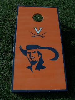
Cornhole Boards
Here are a few custom cornhole boards that I painted. The first, a Washington Redskin/Corona set, I painted and my brother built. The second, a University of Virginia set, I painted and my dad built. I am currently working on a Virginia Tech pair, I'll post those when they're done.
Tuesday, September 15, 2009
River Photomerges
My family has had a place at the Rappahannock River for over 30 years, but last year the campground we went to was closed for good. I thought I should capture our view of the river to remember it by. Both images are photomerges which make up an 180 degree view of the river. The sunset version was taken from a bluff that overlooks the water and the day version was taken from water level on the beach. Enjoy! (If you click on these, be warned they are very big, width wise.)
This was made up of about 4-5 different photos. I really like it because it shows all the boats that belong to my relatives and the boat the furthest on the left (My brother's) had to be photoshoped in later because he was taking his boat on the last ride of the summer- you can see him in there covering his boat too, my family got a kick out of that!
This one was made up of about 12 different photos. I love how it shows how long the river is and the beach of the campground is visible there, as well. I would have liked to have everyone's boat in there too, but they had all gone to spend the day at the sandbar. I was disappointed to find out after I had finished that this one is pretty impossible to print, given its size. I figured it up and to print it at a height of 3 inches it would have a width of several feet, ahhhh very disappointing :(. Oh well, it will live forever digitally!!!
-On a side note, I am able to print the sunset version :)
Labels:
beach,
bluff,
boat,
cliff,
jet ski,
photograph,
photomerge,
photoshop,
Rappahannock River,
river,
sky,
summer,
sunset
Monday, September 14, 2009
LOOOONG Overdue Update
This update has been long in coming. I'm adding pretty much all the finished illustrations I did during this past Spring that I already had digital files for. All of them are a mix of traditional, photoshop, and illustrator techniques. Anything I forget or have to photograph will be added later.
Ed. Illustration also from Feb. that draws comparisons between the inaugurations of President
Also I will be trying to post updates daily now, but they all won't strictly be art updates. With out further adieu here is my art dump, enjoy!! :)
Editorial Illustration from February about how Obama has to deal with a lot of national security changes that Cheney made, while in office, and whether or not he should get rid of them, or keep them as is.
Obama and President Roosevelt (FDR not Teddy).
-I know I need to work on the likeness in these illustrations, but they were my first attempt
at drawing a celebrity, oh well live and learn. :)
Ed. Illustration about Chinese search engine, Baidu, which is the largest search engine in China (their logo is the dog paw print by the way). Baidu has been basically killing the traffic to sites that refuse to buy ads from them, which effectively kills those businesses in the process.
Ed. illustration that discusses human evolution and its roots in Africa.
Illustration of Aesop's The Old Lion. In the fable, the lion is too old to hunt so he feigns illness to trick passing animals to come into the cave to help him. When they come in, he eats them. One day, a fox passes by and calls out to the lion. The lion asks why the fox won't come closer and the fox says that he has noticed that all of the animal tracks lead into the cave, but none come back out.
-I've always wondered how the next scene would play out, would there be an awkward silence or a sudden chase?
Illustration of Aesop's The Wolf and the Crane. As the story goes, the wolf gets a bone caught in his throat and promises the crane a reward, if he will use his long beak to get it out. The crane does so and the wolf starts to leave. The crane asks for his reward and the wolf tells him that being able to stick his head in a wolf's mouth and live to tell the tale is reward enough.
-I've come to realize Aesop's fables are all kind of violent. I didn't really remember them being that way when I was little, go figure.
That's all for now, check back tomorrow for more!
Labels:
Aesop,
Africa,
art,
baidu,
crane,
digital,
evolution,
FDR,
fox,
illustration,
illustrator,
lion,
Obama,
photoshop,
President,
Roosevelt,
search engine,
the old lion,
the wolf and the crane,
wolf
Subscribe to:
Posts (Atom)